
A fellow trader emailed me this. If this data is true, we are in for some interesting times.
THE "CROWD" GOES WILD!!
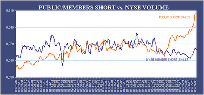
(October 10th, 2006) The Chart of Interest shows you the weekly short sales by the public, or the so called "crowd" or "herd" (dumb money), divided by total weekly NYSE volume, compared to the weekly short sales by NYSE members (smart money). NYSE members are all the well known Wall Street broker firms. They have the best brains and analysts working for them and the have tons of money as well. Short selling by the public has now hit levels like never before in recorded stock market history. It is therefore most unlikely that the market is even near a top, because the "crowd" has until now never beaten the Wall Street pros. (Chart of Dow Jones enclosed for comparison)
if that data is true, it doesnt bode well for bears...
ReplyDeletedid he/she happen to provide a source or link for the data?
thanks
check out this chart...
ReplyDeletehttp://www.freecotcharts.com/charts/DJ.htm
who's right?
too much noise out there...
The site does not say anything about data source.
ReplyDeletethe chart i pasted the link to has this:
ReplyDeleteData source: CFTC.gov
but, that's it...
I have no idea about the data source. I don't base my trading decision on that kind of infrmation.
ReplyDeletelet's come up with some good short scans!
ReplyDeletei dont mean to get too technical or critical regarding the posted chart, but please consider that it is titled "PUBLIC/MEMBERS SHORT vs. NYSE VOLUME". What does that mean?
ReplyDeleteConventially, in the world of analytic graphing, you have "X vs. Y" or "Y as a function of X" where is X is the x-axis and Y is the y-axis.
on the posted chart, you have some y-axis value as a funcion of date. does anyone know what those numbers on the right mean and/or how they were determined?
Thanks!
ps, bored at work...