Pradeep
Any chance you can post a simple how to to replicate this chart set up in tc2007?
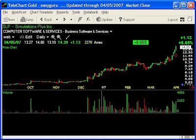
Now here is a simple step by step replication of much of what you see on that chart using the chart of SLP, Simulations Plus Inc. SLP is up 618% from 260 days low as of today.
Chart with no indicator

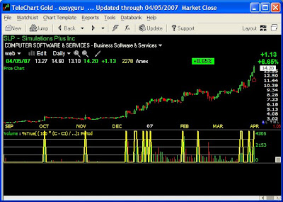
Chart with Breakout
The universal entry signal I use is 4% plus breakout on high volume.
( 100 * (C - C1) / C1) >= 4 AND V >= 1000 AND V > V1
Add this under "Percent True" and set color yellow in middle panel. Now this shows you where this stock met that condition. Some of those days were good entry days.

100% plus indicator
To find out when did this stock meet 100% plus on 260 day low condition I add:
(100 * ((C + .01) - ( MINC260 + .01)) / (MINC260 + .01))>=100
in bottom panel.
Now you can also add
(100 * ((C + .01) - ( MINC260 + .01)) / (MINC260 + .01))>=200
(100 * ((C + .01) - ( MINC260 + .01)) / (MINC260 + .01))>=300
(100 * ((C + .01) - ( MINC260 + .01)) / (MINC260 + .01))>=400
(100 * ((C + .01) - ( MINC260 + .01)) / (MINC260 + .01))>=500
And so on to show you those milestones. Which I have not added in this illustration.

Stop Lines
This is to show how far is current price from 6 month highest close. It can be used to put stops or to eliminate breakouts where it happens 25% below the 6 month high.
The three lines, two in dotted and blue solid are added by going to "Indicator" and putting the following formula. It is also useful for deciding pyramiding points along the way.
In reality the 25% should be calculated as a %% of highest price during the 100% move, which is what my software does, but on TC2007 that kind of calculation is not possible, so the line is workable improvisation.
.95 * MAXC130 Dotted yellow line Setting "plot using price scale"
.85 * MAXC130 Dotted magenta line Setting "plot using price scale"
.75 * MAXC130 Solid blue line Setting "plot using price scale"

I have not added the 4 MACD to this. But to add them you just need to use the link in the previous post. They are not very helpful for individual stocks, but can be useful on Index.
Now you can add to this the "Episodic Pivots" scans in similar manners in different colors.

10 comments:
.25 * MAXC130 Solid blue line Setting "plot using price scale"
Shouldn't the above formula be:
.75 * MAXC130
Let us say 100 was the Maxc130 now a price 25 percent below that will be equal to how much?
25% of 100=25
100-25=75
So what should be the formula.
Your formula will give you a point 75% below the price.
Hi pradeep:
I still think the correct calc is .75 * MAXC130 based upon the way that formula displays on your SLP chart example and my own chart on TC2007.
Using .25, the value of the blue line on 4/5 is 3.55.
Using .75, the value of the blue line on 4/5 is
10.65
Perhaps I am misunderstanding what you are plotting. I thought you meant that you would disregard 4% breakouts if they were below the blue line. i.e., don't take the trade signal unless it is within 25% of the 130 day high close.
Pradeep
I can see Bandy's point. Also, regarding stop lines you say "...where it happens 25% below the 6 month low". However the indicator refers to 6 month high. Can you clarrify?
Apologies in advance if I have missed something ridiculously obvious :-)
I am sorry I made a typo in the post. Now the post is corrected.
Good evening,
When using the 4% formula as an indicator in middle panel I am getting "Formula must not return a boolean value for a Formula Indicator." Any suggestions what I perhaps am doing wrong.
Thanks,
Andy
Put it under "percent True" not "Indicator" because it a is a condition not a continuous series.
Could you be so king to tell me how to exactly do that. I am not the most versatile person with TC2007. Thanks,
Andy
1 With TC2007 open press "I" that will open "Editing Chart Template" window.
2 In that window you will see Top+, Middle+, Bottom+
Out of that press +on Middle.
3 A drop down menu will offer a choice starting with OBV to ADX. In that select" Percent True"
That will add % true1 period+ below volume in your middle window.Click on it, it will open a window " Percent true setting"
4 Enter the formula their. Change color to yellow. Change normal to wide. Close that window
5 Now save your Chart template with new name. This is important as there is a bug in TC2007 where if you don't save with new name, sometime when you restart all new settings vanish.
Thank you. You have been most helpful. Knowing that you lived in India often reminds me of my sister for she lived in Bombay for three years. She loved the country, the city, and the people.
Thanks again.
Andy
Post a Comment