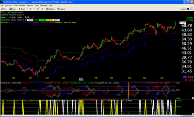
LVS, Las Vegas Sands

These graphs have been prepared using TC2005 , a charting and data program I use and recommend. It has very reliable data feed and easy to use functionality and its very economical.
The yellow, magenta and blue lines below the price chart graph are basically 5, 15 and 25% price levels from six month high price. Used to enter, add to positions and move stops.
The second pane has 4MACD and yearly growth level . I do not use the 4MACDs anymore, but if you want a detailed description of them and how to use them you will find it here. The orange line in the second pane indicates that yearly growth for the stock is above 100%
The third pane has volume, and yellow and white lines. White lines signal quarterly price growth above 35%. The yellow pyramids indicate days on which there was price and volume threshold signal.

2 comments:
Pradeep
Any chance you can post a simple howto to replicate this chart set up in tc2007?
Later today I will put up a post on how to do it in TC2007
Post a Comment